- Awesome WM Widgets
-
Widgets
- Apt Widget
- Battery Widget
- Batteryarc Widget
- Bitbucket Widget
- Bluelight Widget
- Brightness Widget
- Calendar Widget
- Cmus Widget
- CPU Widget
- Docker Widget
- Email Widget
- FS Widget
- Gerrit Widget
- Github Activity Widget
- Github Contributions Widget
- Github Prs Widget
- Gitlab Widget
- Jira Widget
- Logout Menu Widget
- Logout Popup Widget
- Mpdarc Widget
- Mpris Widget
- Net Speed Widget
- Nvidia Widget
- Pacman Widget
- Pactl Widget
- Pomodoroarc Widget
- RAM Widget
- Spotify Widget
- Stackoverflow Widget
- ToDo Widget
- Volume Widget
- Weather Api Widget
- Weather Widget
- Word Clock Widget
- Wpctl Widget
- Prompts
- Tips and tricks
- Snippets
- Links
Awesome WM Widgets
This is a project page of the github repo with set of widgets for Awesome Window Manager plus few articles on widget creation/customization.
Installation
Clone repository under ~/.config/awesome folder. Then follow a README file of the widget.
Support
If you find anything useful here, you can:
- star a repo - this really motivates me to work on this project
- or
- or even become a sponsor
APT widget
This widget shows a list of APT packages to be updated:

Features:
- scrollable list (thanks to this post)
- update single package
- update multiple packages
Customization
It is possible to customize widget by providing a table with all or some of the following config parameters:
| Name | Default | Description |
|---|---|---|
icon_control |
false |
Set or unset whether any click on the screen closes the dropdown after it has been opened. |
Installation
Clone/download repo and use widget in rc.lua:
local apt_widget = require("awesome-wm-widgets.apt-widget.apt-widget")

...
s.mytasklist, -- Middle widget
	{ -- Right widgets
    	layout = wibox.layout.fixed.horizontal,
		...
		apt_widget(),
		...
Or use the following.
		...
		apt_widget({icon_control=true}),
		...
Battery widget
Simple and easy-to-install widget for Awesome Window Manager.
This widget consists of:
- an icon which shows the battery level:

- a pop-up window, which shows up when you hover over an icon:
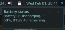 Alternatively you can use a tooltip (check the code):
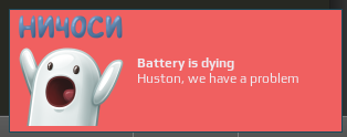
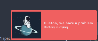
- a pop-up warning message which appears on bottom right corner when battery level is less that 15% (you can get the image here):
Note that widget uses the Arc icon theme, so it should be installed first under /usr/share/icons/Arc/ folder.
Customization
It is possible to customize widget by providing a table with all or some of the following config parameters:
| Name | Default | Description |
|---|---|---|
font |
Play 8 |
Font |
path_to_icons |
/usr/share/icons/Arc/status/symbolic/ |
Path to the folder with icons* |
show_current_level |
false | Show current charge level |
margin_right |
0 | The right margin of the widget |
margin_left |
0 | The left margin of the widget |
display_notification |
false | Display a notification on mouseover |
notification_position |
top_right |
The notification position |
timeout |
10 | How often in seconds the widget refreshes |
warning_msg_title |
Houston, we have a problem |
Title of the warning popup |
warning_msg_text |
Battery is dying |
Text of the warning popup |
warning_msg_position |
bottom_right |
Position of the warning popup |
warning_msg_icon |
~/.config/awesome/awesome-wm-widgets/battery-widget/spaceman.jpg |
Icon of the warning popup |
enable_battery_warning |
true | Display low battery warning |
*Note: the widget expects following icons to be present in the folder:
- battery-caution-charging-symbolic.svg
- battery-empty-charging-symbolic.svg
- battery-full-charged-symbolic.svg
- battery-full-symbolic.svg
- battery-good-symbolic.svg
- battery-low-symbolic.svg
- battery-caution-symbolic.svg
- battery-empty-symbolic.svg
- battery-full-charging-symbolic.svg
- battery-good-charging-symbolic.svg
- battery-low-charging-symbolic.svg
- battery-missing-symbolic.svg
Installation
This widget reads the output of the acpi tool.
Install acpi and check the output:
sudo apt-get install acpi
acpi
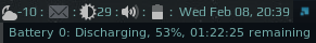
Battery 0: Discharging, 66%, 02:34:06 remaining
Clone/download repo and use widget in rc.lua:
local battery_widget = require("awesome-wm-widgets.battery-widget.battery")

...
s.mytasklist, -- Middle widget
	{ -- Right widgets
    	layout = wibox.layout.fixed.horizontal,
		...
		battery_widget(),
		...
Batteryarc widget

This widget is more informative version of battery widget.
Depending of the battery status it could look following ways:
 - less than 15 percent
 - less than 15 percent, charging
 - between 15 and 40 percent
 - between 15 and 40 percent, charging
 - more than 40 percent
 - more than 40 percent, charging
If a battery level is low then warning popup will show up:
Customization
It is possible to customize widget by providing a table with all or some of the following config parameters:
| Name | Default | Description |
|---|---|---|
font |
Play 6 |
Font |
arc_thickness |
2 | Thickness of the arc |
show_current_level |
false | Show current charge level |
size |
18 | Size of the widget |
timeout |
10 | How often in seconds the widget refreshes |
main_color |
beautiful.fg_color |
Color of the text with the current charge level and the arc |
bg_color |
#ffffff11 |
Color of the charge level background |
low_level_color |
#e53935 |
Arc color when battery charge is less that 15% |
medium_level_color |
#c0ca33 |
Arc color when battery charge is between 15% and 40% |
charging_color |
#43a047 |
Color of the circle inside the arc when charging |
warning_msg_title |
Houston, we have a problem |
Title of the warning popup |
warning_msg_text |
Battery is dying |
Text of the warning popup |
warning_msg_position |
bottom_right |
Position of the warning popup |
warning_msg_icon |
~/.config/awesome/awesome-wm-widgets/batteryarc-widget/spaceman.jpg |
Icon of the warning popup |
enable_battery_warning |
true | Display low battery warning |
show_notification_mode |
on_hover |
How to trigger a notification with the battery status: on_hover, on_click or off |
notification_position |
top_left |
Where to show the notification when triggered. Values: top_right, top_left, bottom_left, bottom_right, top_middle, bottom_middle |
Requirements
This widget requires the acpi command to be available to retrieve battery and
power information.
Installation
Clone/download repo and use widget in rc.lua:
local batteryarc_widget = require("awesome-wm-widgets.batteryarc-widget.batteryarc")
...
s.mytasklist, -- Middle widget
	{ -- Right widgets
    	layout = wibox.layout.fixed.horizontal,
		...
        --[[default]]
		batteryarc_widget(),
        --[[or customized]]
        batteryarc_widget({
            show_current_level = true,
            arc_thickness = 1,
        }),
	}
	...
Troubleshooting
In case of any doubts or questions please raise an issue.
Bitbucket widget
The widget shows the number of pull requests assigned to the user and when clicked shows them in the list with some additional information. When item in the list is clicked - it opens the pull request in the browser.
How it works
Widget uses cURL to query Bitbucket’s REST API. In order to be authenticated, widget uses a netrc feature of cURL, which allows storing basic auth credentials in a .netrc file in home folder.
Bitbucket allows using App Passwords (available in the account settings) - simply generate one for the widget and use it as password in .netrc file.
Customization
It is possible to customize widget by providing a table with all or some of the following config parameters:
| Name | Default | Description |
|---|---|---|
icon |
~/.config/awesome/awesome-wm-widgets/bitbucket-widget/bitbucket-icon-gradient-blue.svg |
Path to the icon |
host |
Required | e.g. http://api.bitbucket.org |
uuid |
Required | e.g. {123e4567-e89b-12d3-a456-426614174000} |
workspace |
Required | Workspace ID |
repo_slug |
Required | Repository slug |
timeout |
60 | How often in seconds the widget refreshes |
Note:
- host most likely should start with api.
- to get your UUID call
curl -s -n 'https://api.bitbucket.org/2.0/user'
Installation
Create a .netrc file in your home directory with following content:
machine api.bitbucket.org
login mikey@tmnt.com
password cowabunga
Then change file’s permissions to 600 (so only you can read/write it):
chmod 600 ~/.netrc
And test if it works by calling the API:
curl -s -n 'https://api.bitbucket.org/2.0/repositories/'
Also, to properly setup required parameters you can use test_bitbucket_api.sh script - it uses the same curl call as widget.
Then clone/download repo and use widget in rc.lua:
local bitbucket_widget = require("awesome-wm-widgets.bitbucket-widget.bitbucket")
...
s.mytasklist, -- Middle widget
	{ -- Right widgets
    	layout = wibox.layout.fixed.horizontal,
		...
		-- default
		bitbucket_widget({
		    host = 'https://api.bitbucket.org',
            uuid = '{123e4567-e89b-12d3-a456-426614174000}',
            workspace = 'workspace',
            repo_slug = 'slug'

		}}),
		...
Blue Light Filter Widget
This widget provides a simple way to toggle a blue light filter using Redshift. It offers an easy mechanism to switch between day and night modes, reducing eye strain during late-night computer use.
| Day Mode | Night Mode |
|---|---|
 |
 |
(I couldn’t capture the effect itself)
I usually use every widget with my custom (kinda janky) wrapper widget to make them look cleaner and more unified.
With wrapper

Installation
Clone this repository then add the widget to your wibar:
local bluelight_widget = require("awesome-wm-widgets.bluelight-widget")
local margin = require("awesome-wm-widgets.margin") -- In case you use my wrapper

s.mytasklist, -- Middle widget
    { -- Right widgets
        layout = wibox.layout.fixed.horizontal,
        ...
        bluelight_widget(), -- Add the widget here
        margin(bluelight_widget(), true), -- Add the widget with my wrapper
        bluelight_widget({night_args = {"-O", "3500", "-P", "-g", "0.75"}}), -- Pass arguments in string or table of strings
        ...
    }
Usage
- Click the widget to toggle between Day Mode and Night Mode.
- Day Mode: Disables the blue light filter.
- Night Mode: Activates the blue light filter with a warm color temperature.
Customization
You can pass arguments to the bluelight method. The following arguments are avaliable:
| Name | Default | Description |
|---|---|---|
cmd |
redshift |
Command to run Redshift. |
night_args |
-O 2500 -g 0.75 -P |
Command options for activating Night Mode. |
day_args |
-x |
Command options for activating Day Mode. |
night_icon |
awesome-wm-widgets/bluelight-widget/moon.svg |
Image to show when Night Mode is activated. |
day_icon |
awesome-wm-widgets/bluelight-widget/sun.svg |
Image to show when Day Mode is activated |
auto |
false | Automatically change between modes based on location (see the wiki) |
Dependencies
- Redshift: Make sure Redshift is installed on your system.
Brightness widget
This widget represents current brightness level, depending on config parameters could be an arcchart or icon with text: 
Customization
It is possible to customize widget by providing a table with all or some of the following config parameters:
| Name | Default | Description |
|---|---|---|
type |
arc |
The widget type. Could be arc or icon_and_text |
program |
light |
The program used to control the brightness, either light, xbacklight, or brightnessctl. |
step |
5 | Step |
base |
20 | Base level to set brightness to on left click. |
path_to_icon |
/usr/share/icons/Arc/status/symbolic/display-brightness-symbolic.svg |
Path to the icon |
font |
beautiful.font |
Font name and size, like Play 12 |
timeout |
1 | How often in seconds the widget refreshes. Check the note below |
tooltip |
false | Display brightness level in a tooltip when the mouse cursor hovers the widget |
percentage |
false | Display a ‘%’ character after the brightness level |
rmb_set_max |
false | Right mouse click sets the brightness level to maximum |
size |
18 | Size of the widget (used only for arc type) |
arc_thickness |
2 | Thickness of the arc (used only for arc type) |
Note: If brightness is controlled only by the widget (either by a mouse, or by a shortcut), then the timeout could be quite large, as there is no reason to synchronize the brightness level.
Installation
To choose the right program argument, first you need to check which of them works better for you.
-
using
xbacklight:Install (on Ubuntu it’s available in the apt repository) it and check if it works by running:
xbacklight -getIf there is no output it means that it doesn’t work, you can either try to fix it, or try to use
light. -
using
lightcommand:Install (on Ubuntu it’s available in the apt repository) from the repo: github.com/haikarainen/light and check if it works by running
 light -G
 49.18
 light -A 5
If you’re on Ubuntu/debian and if the brightness level doesn’t change, try to do this: https://github.com/haikarainen/light/issues/113#issuecomment-632638436.
-
using
brightnessctl:On Ubuntu it is available in the apt repository. Install and check the output of the following command.
brightnessctl --list
Then clone this repo under ~/.config/awesome/:
git clone https://github.com/streetturtle/awesome-wm-widgets.git ~/.config/awesome/awesome-wm-widgets
Require widget at the beginning of rc.lua:
local brightness_widget = require("awesome-wm-widgets.brightness-widget.brightness")
Add the widget to the tasklist:
s.mytasklist, -- Middle widget
    { -- Right widgets
        layout = wibox.layout.fixed.horizontal,
        ...
        -- default
        brightness_widget(),
        -- or customized
        brightness_widget{
            type = 'icon_and_text',
            program = 'xbacklight',
            step = 2,
        }
    }
    ...
Controls
In order to change brightness by shortcuts you can add them to the globalkeys table in the rc.lua:
awful.key({ modkey         }, ";", function () brightness_widget:inc() end, {description = "increase brightness", group = "custom"}),
awful.key({ modkey, "Shift"}, ";", function () brightness_widget:dec() end, {description = "decrease brightness", group = "custom"}),
On a laptop you can use XF86MonBrightnessUp and XF86MonBrightnessDown keys.
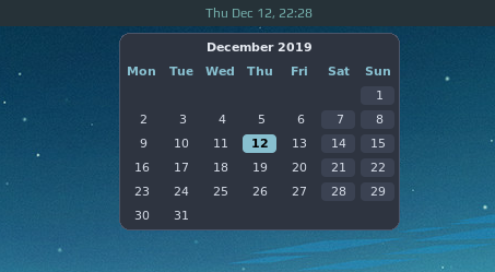
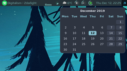
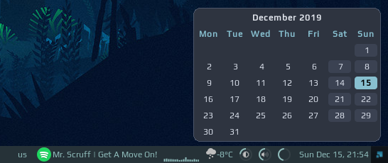
Calendar Widget
Calendar widget for Awesome WM - slightly improved version of the wibox.widget.calendar.
Features
Customization
| Name | Default | Description |
|---|---|---|
| theme | naughty |
The theme to use |
| placement | top |
The position of the popup |
| radius | 8 | The popup radius |
| start_sunday | false | Start the week on Sunday |
| week_numbers | false | Show ISO week numbers (Mon = first) |
| auto_hide | false | Auto hide the popup after timeout |
| timeout | 2 | Auto hide timeout length (in seconds) |
-
themes:
Name Screenshot nord 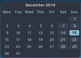
outrun 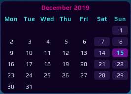
light 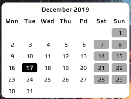
dark 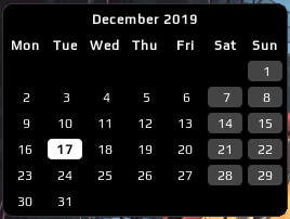
naughty (default) from local theme -
setup widget placement
top center - in case you clock is centered:
top right - for default awesome config:
bottom right - in case your wibar at the bottom:
-
setup first day of week
By setting
start_sundayto true: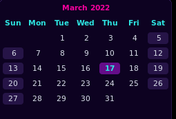
-
mouse support: move to the next and previous month. Using mouse buttons or scroll wheel.
You can configure this by specifying the button to move to next/previous. Usually these are configured as follows. If you want to use other mouse buttons, you can find their number using
xev.number button 4 scroll up 5 scroll down 1 left click 2 right click 3 middles click By default
previous_month_buttonis 5,next_month_buttonis 4.
How to use
This widget needs an ‘anchor’ - another widget which triggers visibility of the calendar. Default mytextclock is the perfect candidate!
Just after mytextclock is instantiated, create the widget and add the mouse listener to it.
local calendar_widget = require("awesome-wm-widgets.calendar-widget.calendar")
-- ...
-- Create a textclock widget
mytextclock = wibox.widget.textclock()
-- default
local cw = calendar_widget()
-- or customized
local cw = calendar_widget({
    theme = 'outrun',
    placement = 'bottom_right',
    start_sunday = true,
    radius = 8,
-- with customized next/previous (see table above)
    previous_month_button = 1,
    next_month_button = 3,
})
mytextclock:connect_signal("button::press",
    function(_, _, _, button)
        if button == 1 then cw.toggle() end
    end)
Cmus widget
This widget shows the currently playing track.
Left click toggles playback.
Installation
Clone the repo under ~/.config/awesome/ and add widget in rc.lua:
local cmus_widget = require('awesome-wm-widgets.cmus-widget.cmus')
...
s.mytasklist, -- Middle widget
    { -- Right widgets
    	layout = wibox.layout.fixed.horizontal,
        ...
        -- default
        cmus_widget(),
        -- customized
        cmus_widget{
            space = 5,
            timeout = 5
        },
Shortcuts
To improve responsiveness of the widget when playback is changed by a shortcut use corresponding methods of the widget:
awful.key({ modkey, "Shift" }, "p",              function () cmus_widget:play_pause() end, {description = "toggle track",   group = "cmus"}),
awful.key({                 }, "XF86AudioPlay",  function () cmus_widget:play()       end, {description = "play track",     group = "cmus"}),
awful.key({                 }, "XF86AudioPause", function () cmus_widget:play()       end, {description = "pause track",    group = "cmus"}),
awful.key({                 }, "XF86AudioNext",  function () cmus_widget:next_track() end, {description = "next track",     group = "cmus"}),
awful.key({                 }, "XF86AudioPrev",  function () cmus_widget:prev_track() end, {description = "previous track", group = "cmus"}),
awful.key({                 }, "XF86AudioStop",  function () cmus_widget:stop()       end, {description = "stop track",      group = "cmus"}),
Customization
It is possible to customize the widget by providing a table with all or some of the following config parameters:
Generic parameter
| Name | Default | Description |
|---|---|---|
font |
beautiful.font |
Font name and size, like Play 12 |
path_to_icons |
/usr/share/icons/Arc/actions/symbolic/ |
Alternative path for the icons |
timeout |
10 | Refresh cooldown |
max_length |
30 | Maximum length of title. Text will be ellipsized if longer. |
space |
3 | Space between icon and track title |
CPU widget

This widget shows the average CPU load among all cores of the machine:
How it works
To measure the load I took Paul Colby’s bash script and rewrote it in Lua, which was quite simple. So awesome simply reads the first line of /proc/stat:
$ cat /proc/stat | grep '^cpu '
cpu  197294 718 50102 2002182 3844 0 2724 0 0 0
and calculates the percentage.
Customization
It is possible to customize widget by providing a table with all or some of the following config parameters:
| Name | Default | Description |
|---|---|---|
width |
50 | Width of the widget |
step_width |
2 | Width of the step |
step_spacing |
1 | Space size between steps |
color |
beautiful.fg_normal |
Color of the graph |
enable_kill_button |
false | Show button which kills the process |
process_info_max_length |
-1 | Truncate the process information. Some processes may have a very long list of parameters which won’t fit in the screen, this options allows to truncate it to the given length. |
timeout |
1 | How often in seconds the widget refreshes |
Example
cpu_widget({
    width = 70,
    step_width = 2,
    step_spacing = 0,
    color = '#434c5e'
})
The config above results in the following widget:
Installation
Clone/download repo and use widget in rc.lua:
local cpu_widget = require("awesome-wm-widgets.cpu-widget.cpu-widget")
...
s.mytasklist, -- Middle widget
	{ -- Right widgets
    	layout = wibox.layout.fixed.horizontal,
		...
		-- default
		cpu_widget(),
		-- or custom
		cpu_widget({
            width = 70,
            step_width = 2,
            step_spacing = 0,
            color = '#434c5e'
        })
		...
Docker / Podman Widget


This widget allows managing Docker and Podman containers, namely start/stop/pause/unpause:

Customization
It is possible to customize widget by providing a table with all or some of the following config parameters:
| Name | Default | Description |
|---|---|---|
icon |
./docker-widget/icons/docker.svg |
Path to the icon |
number_of_containers |
-1 | Number of last created containers to show |
executable_name |
docker |
Name of the executable to use, defaults to docker |
max_widget_width |
270 | Maximum width of the widget before the text breaks |
The executable_name allows you to use Podman instead of Docker. This works since Podman is compatible with Docker in the sense that the syntax and command outputs are identical.
Installation
Clone the repo under ~/.config/awesome/ and add widget in rc.lua:
local docker_widget = require("awesome-wm-widgets.docker-widget.docker")
...
s.mytasklist, -- Middle widget
	{ -- Right widgets
    	layout = wibox.layout.fixed.horizontal,
        ...
        -- default
        docker_widget(),
        -- customized
        docker_widget{
            number_of_containers = 5
        },
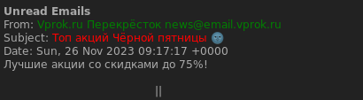
Email widget
This widget consists of an icon with counter which shows the number of unread emails:

And a popup message which appears when mouse hovers over the icon:
Installation
-
Clone this repository to your awesome config folder:
git clone https://github.com/streetturtle/awesome-wm-widgets/email-widget ~/.config/awesome/email-widget -
Create virtual environment and install dependencies:
cd ~/.config/awesome/email-widget python3 -m venv venv source venv/bin/activate pip install -r requirements.txt -
Fill the .env file with your credentials:
cp .env.example .env -
Add widget to rc.lua:
 local email_widget = require("email-widget.email")
 ...
 s.mytasklist, -- Middle widget
     { -- Right widgets
         layout = wibox.layout.fixed.horizontal,
         ...
         email_widget,
         ...
If you want to reduce the time for fetching emails, you can change the maximum number of emails to be fetched in the .env file. Default is 10.
If you want to configure the width of the popup window, you can change this line in the email.lua file:
```lua
width = 800,
```
After this you can change the MAX_BODY_LENGTH variable in the .env file to change the number of characters to be displayed in the popup window. Default is 100.
Next step is restarting awesome. You can do this by pressing Mod+Ctrl+r.
How it works
This widget uses the output of two python scripts, first is called every 20 seconds - it returns number of unread emails and second is called when mouse hovers over an icon and displays content of those emails. For both of them you’ll need to provide your credentials and imap server. For testing, they can simply be called from console:
python ~/.config/awesome/email-widget/count_unread_emails.py
python ~/.config/awesome/email-widget/read_emails.py
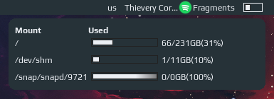
Filesystem Widget
This widget shows filesystem disk space usage based on the df output. When clicked, another widget appears with more detailed information. By default, it monitors the “/” mount. It can be configured with a list of mounts to monitor, though only the first will show in the wibar. To have multiple mounts displayed on the wibar, simply define multiple fs_widgets with different mounts as arguments.
Customization
It is possible to customize widget by providing a table with all or some of the following config parameters:
| Name | Default | Description |
|---|---|---|
mounts |
{ '/' } |
Table with mounts to monitor, check the output from a df command for available options (column Mounted on) |
timeout |
60 | How often in seconds the widget refreshes |
Installation
Clone/download repo and use the widget in rc.lua:
  local fs_widget = require("awesome-wm-widgets.fs-widget.fs-widget")
  ...
  s.mywibox:setup {
      s.mytasklist, -- Middle widget
      { -- Right widgets
      fs_widget(), --default
      fs_widget({ mounts = { '/', '/mnt/music' } }), -- multiple mounts
  ...
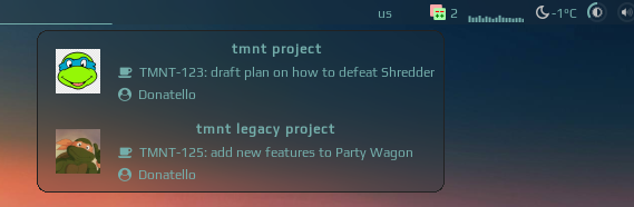
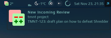
Gerrit widget
This widget shows the number of currently assigned reviews in Gerrit to the user (by default):

When clicked it shows reviews in a list:
Left click on an item will open the review in the default browser, right click will copy the review number, which you can use to checkout this review by running git-review -d <review number>.
Also, if a new review is assigned to the user, there will be a popup:
Customization
It is possible to customize widget by providing a table with all or some of the following config parameters:
| Name | Default | Description |
|---|---|---|
icon |
/.config/awesome/awesome-wm-widgets/gerrit-widget/gerrit_icon.svg |
Path to the icon |
host |
Required | Ex https://gerrit.tmnt.com |
query |
is:reviewer AND status:open AND NOT is:wip |
Query to retrieve reviews |
timeout |
10 | How often in seconds the widget refreshes |
Prerequisites
- curl - used to communicate with Gerrit’s REST API
- Setup netrc which is used to store username and password in order to call API endpoints
Installation
-
This widget relies on Gerrit REST API, so you need to have a permission to access it. You also need to setup netrc, as widget uses curl to communicate with API and you have to be authenticated. To test if you have access to API and netrc setup is correct run following command, you should have a json response:
curl -s --request GET --netrc https://gerrit-host.com/a/changes/\?q\=status:open+AND+NOT+is:wip+AND+is:reviewer | tail -n +2Note:
tail -n +2is needed to skip first line of the response, as gerrit returns some characters there in order to prevent XSS hacks. -
Download json parser for lua from github.com/rxi/json.lua and place it under ~/.config/awesome/ (don’t forget to star a repo):
wget -P ~/.config/awesome/ https://raw.githubusercontent.com/rxi/json.lua/master/json.lua -
Clone this repo (if not cloned yet) under ~/.config/awesome/:
git clone https://github.com/streetturtle/awesome-wm-widgets.git ~/.config/awesome/ -
Require widget at the top of the rc.lua:
local gerrit_widget = require("awesome-wm-widgets.gerrit-widget.gerrit") -
Add widget to the tasklist:
 s.mytasklist, -- Middle widget
     { -- Right widgets
         layout = wibox.layout.fixed.horizontal,
         ...
         --default
         gerrit_widget({host = 'https://gerrit.tmnt.com'}),
         --customized
         gerrit_widget({
             host = 'https://gerrit.tmnt.com',
             query = 'is:reviewer AND is:wip'
         })
         ...
GitHub Activity Widget
Widget shows recent activities on GitHub. It is very similar to the GitHub’s “All activity” feed on the main page:

Mouse click on the item opens repo/issue/pr depending on the type of the activity. Mouse click on user’s avatar opens user GitHub profile.
Customization
It is possible to customize widget by providing a table with all or some of the following config parameters:
| Name | Default | Description |
|---|---|---|
icon |
github.png from the widget sources |
Widget icon displayed on the wibar |
username |
Required | GitHub username |
number_of_events |
10 | Number of events to display in the list |
Installation
Clone repo under ~/.config/awesome/ and add widget in rc.lua:
local github_activity_widget = require("awesome-wm-widgets.github-activity-widget.github-activity-widget")
...
s.mytasklist, -- Middle widget
	{ -- Right widgets
    	layout = wibox.layout.fixed.horizontal,
        ...
        -- default
        github_activity_widget{
            username = 'streetturtle',
        },
        -- customized
        github_activity_widget{
            username = 'streetturtle',
            number_of_events = 5
        },
How it works
Everything starts with this timer, which gets recent activities by calling GitHub Events API and stores the response under /.cache/awmw/github-activity-widget/activity.json directory:
gears.timer {
    timeout   = 600,   -- calls every ten minutes
    call_now  = true,
    autostart = true,
    callback  = function()
        spawn.easy_async(string.format(UPDATE_EVENTS_CMD, username, CACHE_DIR), function(stdout, stderr)
            if stderr ~= '' then show_warning(stderr) return end
        end)
    end
}
There are several reasons to store output in a file and then use it as a source to build the widget, instead of calling it everytime the widget is opened:
- activity feed does not update that often
- events API doesn’t provide filtering of fields, so the output is quite large (300 events)
- it’s much faster to read file from filesystem
Next important part is rebuild_widget function, which is called when mouse button clicks on the widget on the wibar. It receives a json string which contains first n events from the cache file. Those events are processed by jq (get first n events, remove unused fields, slightly change the json structure to simplify serialization to lua table). And then it builds a widget, row by row in a loop. To display the text part of the row we already have all neccessary information in the json string which was converted to lua table. But to show an avatar we should download it first. This is done in the following snippet. First it creates a template and then checks if file already exists, and sets it in template, otherwise, downloads it asynchronously and only then sets in:
local avatar_img = wibox.widget {
    resize = true,
    forced_width = 40,
    forced_height = 40,
    widget = wibox.widget.imagebox
}

if gfs.file_readable(path_to_avatar) then
    avatar_img:set_image(path_to_avatar)
else
    -- download it first
    spawn.easy_async(string.format(
            DOWNLOAD_AVATAR_CMD,
            CACHE_DIR,
            event.actor.id,
            event.actor.avatar_url),
            -- and then set
            function() avatar_img:set_image(path_to_avatar) end)
end
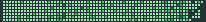
GitHub Contributions Widget
The widget is inspired by https://github-contributions.now.sh/ and relies on its API.
It shows the contribution graph, similar to the one on the github profile page: 
You might wonder what could be the reason to have your github’s contributions in front of you all day long? The more you contribute, the nicer widget looks! Check out Thomashighbaugh’s graph:
Customization
It is possible to customize the widget by providing a table with all or some of the following config parameters:
| Name | Default | Description |
|---|---|---|
username |
streetturtle |
GitHub username |
days |
365 | Number of days in the past, more days - wider the widget |
color_of_empty_cells |
Theme’s default | Color of the days with no contributions |
with_border |
true | Should the graph contains border or not |
margin_top |
1 | Top margin |
theme |
standard |
Color theme of the graph, see below |
Note: Widget height is 21px (7 rows of 3x3 cells). So it would look nice on a wibar of 22-24px height.
Themes
Following themes are available:
| Theme name | Preview |
|---|---|
| standard |  |
| classic |  |
| teal |  |
| leftpad |  |
| dracula |  |
| pink |  |
To add a new theme, simply add a new entry in themes table (themes.lua) with the colors of your theme.
Screenshots
1000 days, with border:

365 days, no border:
Installation
Clone/download repo under ~/.config/awesome and use widget in rc.lua:
local github_contributions_widget = require("awesome-wm-widgets.github-contributions-widget.github-contributions-widget")
...
s.mytasklist, -- Middle widget
	{ -- Right widgets
    	layout = wibox.layout.fixed.horizontal,
		...
		-- default
        github_contributions_widget({username = '<your username>'}),
		...
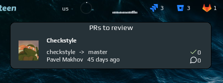
GitHub PRs Widget

The widget shows the number of pull requests assigned to the user and when clicked shows additional information, such as
- author’s name and avatar (opens user profile page when clicked);
- PR name (opens MR when clicked);
- name of the repository;
- when was created;
- number of comments;

Customization
It is possible to customize widget by providing a table with all or some of the following config parameters:
| Name | Default | Description |
|---|---|---|
reviewer |
Required | GitHub username |
Installation
Install and setup GitHub CLI Clone/download repo and use widget in rc.lua:
local github_prs_widget = require("awesome-wm-widgets.github-prs-widget")
...
s.mytasklist, -- Middle widget
{ -- Right widgets
    layout = wibox.layout.fixed.horizontal,
    ...
    github_prs_widget {
        reviewer = 'streetturtle'
    },
}
...
Gitlab widget

The widget shows the number of merge requests assigned to the user and when clicked shows additional information, such as
- author’s name and avatar (opens user profile page when clicked);
- MR name (opens MR when clicked);
- source and target branches;
- when was created;
- number of comments;
- number of approvals.
Customization
It is possible to customize widget by providing a table with all or some of the following config parameters:
| Name | Default | Description |
|---|---|---|
icon |
./icons/gitlab-icon.svg |
Path to the icon |
host |
Required | e.g. https://gitlab.yourcompany.com |
access_token |
Required | e.g. h2v531iYASDz6McxYk4A |
timeout |
60 | How often in seconds the widget should be refreshed |
Note:
- to get the access token, go to User Settings -> Access Tokens and generate a token with api scope
Installation
Clone/download repo and use widget in rc.lua:
local gitlab_widget = require("awesome-wm-widgets.gitlab-widget.gitlab")
...
s.mytasklist, -- Middle widget
	{ -- Right widgets
    	layout = wibox.layout.fixed.horizontal,
		...
		-- default
        gitlab_widget{
            host = 'https://gitlab.yourcompany.com',
            access_token = 'h2v531iYASDz6McxYk4A'
        },
		...
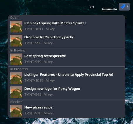
Jira widget
This widget shows the number of tickets assigned to the user (or any other result of a JQL query, see Customization section) and when clicked shows them in a list, grouped by ticket status. Left-click on an item opens the issue in the default browser:
How it works
Widget uses cURL to query Jira’s REST API. In order to be authenticated, widget uses a netrc feature of the cURL, which is basically to store basic auth credentials in a .netrc file in home folder.
If you are on Atlassian Cloud, then instead of providing a password in netrc file you can set an API token which is a safer option, as you can revoke/change the token at any time.
Customization
It is possible to customize widget by providing a table with all or some of the following config parameters:
| Name | Default | Description |
|---|---|---|
host |
Required | e.g. http://jira.tmnt.com |
query |
jql=assignee=currentuser() AND resolution=Unresolved |
JQL query |
icon |
~/.config/awesome/awesome-wm-widgets/jira-widget/jira-mark-gradient-blue.svg |
Path to the icon |
timeout |
600 | How often in seconds the widget refreshes |
Installation
Create a .netrc file in your home directory with following content:
machine turtlejira.com
login mikey@tmnt.com
password cowabunga
Then change file’s permissions to 600 (so only you can read/write it):
chmod 600 ~/.netrc
And test if it works by calling the API (-n option is to use the .netrc file for authentication):
curl -n 'https://turtleninja.com/rest/api/2/search?jql=assignee=currentuser()+AND+resolution=Unresolved'
Clone/download repo and use the widget in rc.lua:
local jira_widget = require("awesome-wm-widgets.jira-widget.jira")
...
s.mytasklist, -- Middle widget
	{ -- Right widgets
    	layout = wibox.layout.fixed.horizontal,
		...
		-- default
		jira_widget({host = 'http://jira.tmnt.com'}),
		...
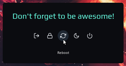
Logout Menu Widget
This widget shows a menu with options to log out from the current session, lock, reboot, suspend and power off the computer, similar to logout-popup-widget:
Installation
Clone this repo (if not cloned yet) under ./.config/awesome/
cd ./.config/awesome/
git clone https://github.com/streetturtle/awesome-wm-widgets
Then add the widget to the wibar:
local logout_menu_widget = require("awesome-wm-widgets.logout-menu-widget.logout-menu")

s.mytasklist, -- Middle widget
    { -- Right widgets
        layout = wibox.layout.fixed.horizontal,
        ...
        -- default
        logout_menu_widget(),
        -- custom
        logout_menu_widget{
            font = 'Play 14',
            onlock = function() awful.spawn.with_shell('i3lock-fancy') end
        }
        ...
Customization
It is possible to customize the widget by providing a table with all or some of the following config parameters:
| Name | Default | Description |
|---|---|---|
font |
beautiful.font |
Font of the menu items |
onlogout |
function() awesome.quit() end |
Function which is called when the logout item is clicked |
onlock |
function() awful.spawn.with_shell("i3lock") end |
Function which is called when the lock item is clicked |
onreboot |
function() awful.spawn.with_shell("reboot") end |
Function which is called when the reboot item is clicked |
onsuspend |
function() awful.spawn.with_shell("systemctl suspend") end |
Function which is called when the suspend item is clicked |
onpoweroff |
function() awful.spawn.with_shell("shutdown now") end |
Function which is called when the poweroff item is clicked |
onreload |
function() awesome.restart() end |
Function which is called when the reload item is clicked |
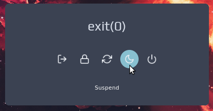
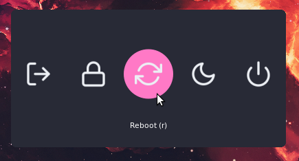
Logout Popup Widget
Widget which allows performing lock, reboot, log out, power off and sleep actions. It can be called either by a shortcut, or by clicking on a widget in wibar.

When the widget is shown, following shortcuts can be used:
- Escape - hide widget
- s - shutdown
- r - reboot
- u - suspend
- k - lock
- l - log out
Installation
Clone this (if not cloned yet) and the awesome-buttons repos under ./.config/awesome/
cd ./.config/awesome/
git clone https://github.com/streetturtle/awesome-wm-widgets
git clone https://github.com/streetturtle/awesome-buttons
Then
-
to show by a shortcut - define a shortcut in
globalkeys:local logout_popup = require("awesome-wm-widgets.logout-popup-widget.logout-popup") ... globalkeys = gears.table.join( ... awful.key({ modkey }, "l", function() logout_popup.launch() end, {description = "Show logout screen", group = "custom"}), -
to show by clicking on a widget in wibar - add widget to the wibar:
  local logout_popup = require("awesome-wm-widgets.logout-popup-widget.logout-popup")

  s.mytasklist, -- Middle widget
          { -- Right widgets
              layout = wibox.layout.fixed.horizontal,
              ...
              logout_popup.widget{},
              ...
Customisation
| Name | Default | Description |
|---|---|---|
icon |
power.svg |
If used as widget - the path to the widget’s icon |
icon_size |
40 | Size of the icon |
icon_margin |
16 | Margin around the icon |
bg_color |
beautiful.bg_normal |
The color the background of the |
accent_color |
beautiful.bg_focus |
The color of the buttons |
text_color |
beautiful.fg_normal |
The color of text |
label_color |
beautiful.fg_normal |
The color of the button’s label |
phrases |
{ 'Goodbye!' } |
The table with phrase(s) to show, if more than one provided, the phrase is chosen randomly. Leave empty ({}) to hide the phrase |
hide_on_leave |
false |
If the popup should be hidden when the mouse leaves it |
onlogout |
function() awesome.quit() end |
Function which is called when the logout button is pressed |
onlock |
function() awful.spawn.with_shell("systemctl suspend") end |
Function which is called when the lock button is pressed |
onreboot |
function() awful.spawn.with_shell("reboot") end |
Function which is called when the reboot button is pressed |
onsuspend |
function() awful.spawn.with_shell("systemctl suspend") end |
Function which is called when the suspend button is pressed |
onpoweroff |
function() awful.spawn.with_shell("shutdown now") end |
Function which is called when the poweroff button is pressed |
onlogout_key |
l | Keybinding to execute the logout function |
onlock_key |
k | Keybinding to execute the lock function |
onreboot_key |
r | Keybinding to execute the reboot function |
onsuspend_key |
u | Keybinding to execute the suspend function |
onpoweroff_key |
s | Keybinding to execute the poweroff function |
ignore_case |
true | Ignore if CAPS LOCK is enabled |
Some color themes for inspiration:
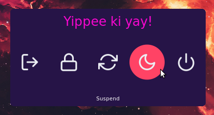
logout.launch{
    bg_color = "#261447", accent_color = "#ff4365", text_color = '#f706cf', icon_size = 40, icon_margin = 16, -- outrun
    -- bg_color = "#0b0c10", accent_color = "#1f2833", text_color = '#66fce1', -- dark
    -- bg_color = "#3B4252", accent_color = "#88C0D0", text_color = '#D8DEE9', -- nord
    -- bg_color = "#282a36", accent_color = "#ff79c6", phrases = {}, -- dracula, no phrase
    phrases = {"exit(0)", "Don't forget to be awesome.", "Yippee ki yay!"},
}
MPD Widget
Music Player Daemon widget by @raphaelfournier.
Prerequisites
Install mpd (Music Player Daemon itself) and mpc (Music Player Client - program for controlling mpd), both should be available in repo, e.g. for Ubuntu:
sudo apt-get install mpd mpc
Installation
To use this widget clone repo under ~/.config/awesome/ and then add it in rc.lua:
local mpdarc_widget = require("awesome-wm-widgets.mpdarc-widget.mpdarc")
...
s.mytasklist, -- Middle widget
	{ -- Right widgets
    layout = wibox.layout.fixed.horizontal,
		...
    mpdarc_widget,
		...
MPRIS Widget (In progress)
Music Player Info widget by @mgabs
Prerequisites
Install playerctl (mpris implementation), should be available in repo, e.g. for Ubuntu:
sudo apt-get install playerctl
Installation
To use this widget clone repo under ~/.config/awesome/ and then add it in rc.lua:
local mpris_widget = require("awesome-wm-widgets.mpris-widget")
...
s.mytasklist, -- Middle widget
	{ -- Right widgets
    layout = wibox.layout.fixed.horizontal,
		...
    mpris_widget(),
		...
Net Speed Widget
The widget and README are in progress.
Installation
Clone/download repo and use widget in rc.lua:
local net_speed_widget = require("awesome-wm-widgets.net-speed-widget.net-speed")
...
s.mytasklist, -- Middle widget
	{ -- Right widgets
    	layout = wibox.layout.fixed.horizontal,
		...
		net_speed_widget(),
    		...
	}
	...
Nvidia Widget
This widget shows you some stats like your total VRAM usage, power utilization, GPU temperature, as well as the top processes that are utilizing your VRAM. Clicking on the widget will show more details.
What the Widget Shows

Main Widget Display:
- GPU temperature (°C)
- Power usage (current/max watts)
- VRAM usage (used/total MiB) with visual arc indicator
Popup Details (click to open):
- GPU name and driver version
- Temperature (Celsius and Fahrenheit)
- Power consumption
- Memory usage
- Top 10 processes using VRAM (PID, process name, memory used)
Dependencies
You should probably already have these installed but incase you don’t, this project depends on nvidia-smi, as well as some standard Unix tools like awk, sort, and head to work.
Example Usage
local nvidia_widget = require("awesome-wm-widgets.nvidia-widget.nvidia-widget")

s.mywibox:setup({
    layout = wibox.layout.align.horizontal,
    {
        layout = wibox.layout.fixed.horizontal,
        wibox.container.background(nvidia_widget({ popup_bg = "#2E3440A0" }), "#27374DA0")
    }
})
Parameters
| Name | Default | Description |
|---|---|---|
refresh_rate |
1 |
Refresh interval in seconds for updating GPU statistics |
popup_bg |
"#2E3440" |
Background color of the popup window (hex color string) |
popup_border_color |
"#4C566A" |
Border color of the popup window (hex color string) |
Pacman Widget
This widget displays the number of upgradable Pacman packages. Clicking the icon reveals a scrollable list of available upgrades. A full system upgrade can be performed from the widget via Polkit.

Requirements
lxpolkit is the default Polkit agent.
The widget also uses the checkupdates script from the pacman-contrib package.
Installation
Clone the repo under ~/.config/awesome/ and add the following to rc.lua:
local pacman_widget = require('awesome-wm-widgets.pacman-widget.pacman')
...
s.mytasklist, -- Middle widget
	{ -- Right widgets
    	layout = wibox.layout.fixed.horizontal,
        ...
        -- default
        pacman_widget(),
        -- custom (shown with defaults)
        pacman_widget {
            interval = 600,	-- Refresh every 10 minutes
            popup_bg_color = '#222222',
            popup_border_width = 1,
            popup_border_color = '#7e7e7e',
            popup_height = 10,	-- 10 packages shown in scrollable window
            popup_width = 300,
            polkit_agent_path = '/usr/bin/lxpolkit'
        },
Pactl volume widget
This is a volume widget that uses pactl only for controlling volume and
selecting sinks and sources. Hence, it can be used with PulseAudio or PipeWire
likewise, unlike the original Volume widget.
Other than that it is heavily based on the original widget, including its customization and icon options. For screenshots, see the original widget.
Installation
Clone the repo under ~/.config/awesome/ and add widget in rc.lua:
local volume_widget = require('awesome-wm-widgets.pactl-widget.volume')
...
s.mytasklist, -- Middle widget
	{ -- Right widgets
    	layout = wibox.layout.fixed.horizontal,
        ...
        -- default
        volume_widget(),
        -- customized
        volume_widget{
            widget_type = 'arc'
        },
Shortcuts
To improve responsiveness of the widget when volume level is changed by a shortcut use corresponding methods of the widget:
awful.key({}, "XF86AudioRaiseVolume", function () volume_widget:inc(5) end),
awful.key({}, "XF86AudioLowerVolume", function () volume_widget:dec(5) end),
awful.key({}, "XF86AudioMute", function () volume_widget:toggle() end),
Customization
It is possible to customize the widget by providing a table with all or some of the following config parameters:
Generic parameter
| Name | Default | Description |
|---|---|---|
mixer_cmd |
pavucontrol |
command to run on middle click (e.g. a mixer program) |
step |
5 | How much the volume is raised or lowered at once (in %) |
widget_type |
icon_and_text |
Widget type, one of horizontal_bar, vertical_bar, icon, icon_and_text, arc |
device |
@DEFAULT_SINK@ |
Select the device name to control |
tooltip |
false | Display volume level in a tooltip when the mouse cursor hovers the widget |
For more details on parameters depending on the chosen widget type, please refer to the original Volume widget.
Pomodoro Widget
Note: This widget is under construction.
Installation
Dependencies
This widget is based on @jsspencer’s pomo - a simple pomodoro timer.
First install/clone it anywhere you like, then either
- in the widget’s code provide path to the pomo.sh, or
- make a soft link in /usr/local/bin/ to it, e.g.:
sudo ln -sf /opt/pomodoro/pomo.sh /usr/local/bin/pomo
Note that by default widget’s code expects the second way and simply calls pomo.
Enabling the widget
Add the widget to rc.lua:
--- Create the pomodoro widget
local pomo_widget = require('awesome-wm-widgets.pomodoroarc-widget.pomodoroarc')

--- Add the widget to the tasklist
s.mytasklist, -- Middle widget
    { -- Right widgets
        layout = wibox.layout.fixed.horizontal,
        ...
        pomo_widget,
        ...
Usage
Left clicking (“mouse button 1”) on the pomodoro widget starts the timer. Middle click (“mouse button 2”) pauses and unpauses the timer. Right click (“mouse button 3”) stops the timer.
Note that a left click will always restart the timer from scratch. Remember to middle click to unpause.
The circular pomodoro widget will give an approximate indication of how much time is remaining, hovering over the widget will display the exact remaining time.
The duration (in minutes) of work and breaks can be configured in the pomo.sh script, or by setting environment variables POMO_WORK_TIME and POMO_BREAK_TIME.
RAM Widget
This widget shows RAM usage. When clicked, another widget appears with more detailed information:
Note: This widget is compatible with Awesome v4.3+, as it is using awful.popup.
Customization
It is possible to customize widget by providing a table with all or some of the following config parameters:
| Name | Default | Description |
|---|---|---|
color_used |
beautiful.bg_urgent |
Color for used RAM |
color_free |
beautiful.fg_normal |
Color for free RAM |
color_buf |
beautiful.border_color_active |
Color for buffers/cache |
widget_height |
25 | Height of the widget |
widget_width |
25 | Width of the widget |
widget_show_buf |
false | Whether to display buffers/cache separately in the tray widget. If false, buffers/cache are considered free RAM. |
timeout |
1 | How often in seconds the widget refreshes |
Installation
Clone/download repo and use widget in rc.lua:
local ram_widget = require("awesome-wm-widgets.ram-widget.ram-widget")
...
s.mytasklist, -- Middle widget
	{ -- Right widgets
    	layout = wibox.layout.fixed.horizontal,
		...
		ram_widget(),
    		...
	}
	...
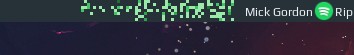
Spotify widget
This widget displays currently playing song on Spotify for Linux client: 
Some features:
- status icon which shows if music is currently playing
- artist and name of the current song
- dim widget if spotify is paused
- trim long artist/song names
- tooltip with more info about the song
Controls
- left click - play/pause
- scroll up - play next song
- scroll down - play previous song
Dependencies
Note that widget uses the Arc icon theme, so it should be installed first under /usr/share/icons/Arc/ folder.
Customization
It is possible to customize widget by providing a table with all or some of the following config parameters:
| Name | Default | Description |
|---|---|---|
play_icon |
/usr/share/icons/Arc/actions/24/player_play.png |
Play icon |
pause_icon |
/usr/share/icons/Arc/actions/24/player_pause.png |
Pause icon |
font |
Play 9 |
Font |
dim_when_paused |
false | Decrease the widget opacity if spotify is paused |
dim_opacity |
0.2 | Widget’s opacity when dimmed, dim_when_paused should be set to true |
max_length |
15 | Maximum length of artist and title names. Text will be ellipsized if longer. |
show_tooltip |
true | Show tooltip on hover with information about the playing song |
timeout |
1 | How often in seconds the widget refreshes |
sp_bin |
sp |
Path to the sp binary. Required if sp is not in environment PATH. |
Example:
spotify_widget({
    font = 'Ubuntu Mono 9',
    play_icon = '/usr/share/icons/Papirus-Light/24x24/categories/spotify.svg',
    pause_icon = '/usr/share/icons/Papirus-Dark/24x24/panel/spotify-indicator.svg',
    dim_when_paused = true,
    dim_opacity = 0.5,
    max_length = -1,
    show_tooltip = false,
    sp_bin = gears.filesystem.get_configuration_dir() .. 'scripts/sp'
})
Gives following widget
Playing:

Paused:

Installation
First you need to have spotify CLI installed, it uses dbus to communicate with spotify-client:
git clone https://gist.github.com/fa6258f3ff7b17747ee3.git
cd ./fa6258f3ff7b17747ee3
chmod +x sp
# This widget will work by default if the binary is in the system PATH
sudo cp ./sp /usr/local/bin/
# Alternatively, you may save the binary anywhere and supply the path via this widget's sp_bin argument:
# cp ./sp ~/.config/awesome/scripts/
Then clone repo under ~/.config/awesome/ and add widget in rc.lua:
local spotify_widget = require("awesome-wm-widgets.spotify-widget.spotify")
...
s.mytasklist, -- Middle widget
	{ -- Right widgets
    	layout = wibox.layout.fixed.horizontal,
		...
        -- default
        spotify_widget(),
        -- customized
        spotify_widget({
           font = 'Ubuntu Mono 9',
           play_icon = '/usr/share/icons/Papirus-Light/24x24/categories/spotify.svg',
           pause_icon = '/usr/share/icons/Papirus-Dark/24x24/panel/spotify-indicator.svg'
        }),
		...
Stackoverflow widget
When clicked, widget shows latest questions from stackoverflow.com with a given tag(s).
Customization
It is possible to customize widget by providing a table with all or some of the following config parameters:
| Name | Default | Description |
|---|---|---|
icon |
/.config/awesome/awesome-wm-widgets/stackoverflow-widget/so-icon.svg |
Path to the icon |
limit |
5 | Number of items to show in the widget |
tagged |
awesome-wm |
Tag, or comma-separated tags |
timeout |
300 | How often in seconds the widget refreshes |
Installation
-
Clone this repo (if not cloned yet) under ~/.config/awesome/:
git clone https://github.com/streetturtle/awesome-wm-widgets.git ~/.config/awesome/ -
Require widget at the top of the rc.lua:
local stackoverflow_widget = require("awesome-wm-widgets.stackoverflow-widget.stackoverflow") -
Add widget to the tasklist:
 s.mytasklist, -- Middle widget
     { -- Right widgets
         layout = wibox.layout.fixed.horizontal,
         ...
         --default
         stackoverflow_widget(),
         --customized
         stackoverflow_widget({
             limit = 10
         })
         ...
ToDo Widget
This widget displays a list of todo items and allows marking item as done/undone, delete an item and create new ones:
Installation
Widget persists todo items as JSON, so in order to simplify JSON serialization/deserialization, download json.lua from this repository: https://github.com/rxi/json.lua under the ~/.config/awesome folder. And don’t forget to star the repo!
Then clone this repository under ~/.config/awesome/ and add the widget in rc.lua:
local todo_widget = require("awesome-wm-widgets.todo-widget.todo")
...
s.mytasklist, -- Middle widget
	{ -- Right widgets
    	layout = wibox.layout.fixed.horizontal,
		...
        -- default
        todo_widget(),
		...
Also note that widget uses Arc Icons and expects them to be installed under /usr/share/icons/Arc/.
Theming
Widget uses your theme’s colors. In case you want to have different colors, without changing your theme, please create an issue for it. I’ll extract them as widget parameters.
Volume widget
Volume widget based on amixer (is used for controlling the audio volume) and pacmd (is used for selecting a sink/source). Also, the widget provides an easy way to customize how it looks, following types are supported out-of-the-box:

From left to right: horizontal_bar, vertical_bar, icon, icon_and_text, arc
A right-click on the widget opens a popup where you can choose a sink/source:

Left click toggles mute and middle click opens a mixer (pavucontrol by default).
Features
- switch between sinks/sources by right click on the widget;
- more responsive than previous versions of volume widget, which were refreshed once a second;
- 5 predefined customizable looks;
Installation
Clone the repo under ~/.config/awesome/ and add widget in rc.lua:
local volume_widget = require('awesome-wm-widgets.volume-widget.volume')
...
s.mytasklist, -- Middle widget
	{ -- Right widgets
    	layout = wibox.layout.fixed.horizontal,
        ...
        -- default
        volume_widget(),
        -- customized
        volume_widget{
            widget_type = 'arc'
        },
Note: The widget uses the following command to get the current volume: amixer -c 1 -D pulse sget Master. Please make sure that it works for you, otherwise you need to set some parameters by entering this command in the terminal:
Command output:
- Some data of a mixer: Override all parameters you’ve changed
- Error
Invalid card number: Change parameter-c/card - Error
Mixer attach pulse error: No such file or directory: Change parameter-D/device - Error
Unable to find simple control 'Master',0: Change parametermixctrl
Note: amixer[ -c ...][ -D ...] returns a list of Mixers for the selected card/device. Omitting -D falls back to default.
Shortcuts
To improve responsiveness of the widget when volume level is changed by a shortcut use corresponding methods of the widget:
awful.key({ modkey }, "]", function() volume_widget:inc(5) end),
awful.key({ modkey }, "[", function() volume_widget:dec(5) end),
awful.key({ modkey }, "\\", function() volume_widget:toggle() end),
You also can use Functional keycodes instead of symbols, e.g. XF86AudioRaiseVolume instead of "]".
awful.key({}, "XF86AudioRaiseVolume", function() volume_widget.inc() end),
awful.key({}, "XF86AudioLowerVolume", function() volume_widget.dec() end),
awful.key({}, "XF86AudioMute", function() volume_widget.toggle() end),
If you don’t know the name of the key, you can use xev to find it out.
Or you can use amixer and playerctl to control the volume and media players.
awful.key({}, "XF86AudioLowerVolume", function ()
    awful.util.spawn("amixer -q -D pulse sset Master 5%-", false) end),
awful.key({}, "XF86AudioRaiseVolume", function ()
    awful.util.spawn("amixer -q -D pulse sset Master 5%+", false) end),
awful.key({}, "XF86AudioMute", function ()
    awful.util.spawn("amixer -D pulse set Master 1+ toggle", false) end),
-- Media Keys
awful.key({}, "XF86AudioPlay", function()
    awful.util.spawn("playerctl play-pause", false) end),
awful.key({}, "XF86AudioNext", function()
    awful.util.spawn("playerctl next", false) end),
awful.key({}, "XF86AudioPrev", function()
    awful.util.spawn("playerctl previous", false) end),
Customization
It is possible to customize the widget by providing a table with all or some of the following config parameters:
Generic parameter
| Name | Default | Description |
|---|---|---|
mixer_cmd |
pavucontrol |
command to run on middle click (e.g. a mixer program) |
toggle_cmd |
nil | Use custom command instead of amixer ... toggle because amixer’s unmute option seems to be broken |
step |
5 | How much the volume is raised or lowered at once (in %) |
widget_type |
icon_and_text |
Widget type, one of horizontal_bar, vertical_bar, icon, icon_and_text, arc |
card |
0 | Select the card name to control |
device |
pulse |
Select the device name to control |
mixctrl |
Master |
Select the mixer name to control |
value_type |
-M |
Select how the volume is increased/ decreased (intended for -M/ -R parameters). See man amixer for additional info |
Note: If unmuting or toggling using the default amixer command does not work, this command may work: pactl set-sink-mute [card] toggle
Depends on the chosen widget type add parameters from the corresponding section below:
icon parameters
| Name | Default | Description |
|---|---|---|
icon_dir |
[widget_dir]/icons |
Path to the folder with icons (absolute path) |
Note: If you are changing icons, the folder should contain the following .svg images:
- audio-volume-high-symbolic
- audio-volume-medium-symbolic
- audio-volume-low-symbolic
- audio-volume-muted-symbolic
icon_and_text parameters
| Name | Default | Description |
|---|---|---|
icon_dir |
[widget_dir]/icons |
Path to the folder with icons (absolute path) |
font |
beautiful.font |
Font name and size, like Play 12 |
arc parameters
| Name | Default | Description |
|---|---|---|
thickness |
2 | Thickness of the arc |
main_color |
beautiful.fg_color |
Color of the arc |
bg_color |
#ffffff11 |
Color of the arc’s background |
mute_color |
beautiful.fg_urgent |
Color of the arc when mute |
size |
18 | Size of the widget |
horizontal_bar parameters
| Name | Default | Description |
|---|---|---|
main_color |
beautiful.fg_normal |
Color of the bar |
mute_color |
beautiful.fg_urgent |
Color of the bar when mute |
bg_color |
#ffffff11 |
Color of the bar’s background |
width |
50 | The bar width |
margins |
10 | Top and bottom margins (if your wibar is 22 px high, bar will be 2 px = 22 - 2*10) |
shape |
gears.shape.bar |
A shape painter function (see gears.shape) |
with_icon |
true | Show volume icon |
Note: I didn’t figure out how the forced_height property of the progressbar widget works (maybe it doesn’t work at all), thus there is a workaround with margins.
vertical_bar parameters
| Name | Default | Description |
|---|---|---|
main_color |
beautiful.fg_normal |
Color of the bar |
mute_color |
beautiful.fg_urgent |
Color of the bar when mute |
bg_color |
#ffffff11 |
Color of the bar’s background |
width |
10 | The bar width |
margins |
20 | Top and bottom margins (if your wibar is 22 px high, bar will be 2 px = 22 - 2*10) |
shape |
gears.shape.bar |
A shape painter function (see gears.shape) |
with_icon |
true | Show volume icon |
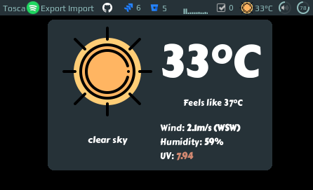
WeatherAPI Widget
This widget shows current weather, including humidity, wind speed, and UV index.
Customization
It is possible to customize widget by providing a table with all or some of the following config parameters:
| Name | Default | Description |
|---|---|---|
| coordinates | Required | Table with two elements: latitude and longitude, e.g. {46.204400, 6.143200} |
| api_key | Required | Follow the documentation |
| font_name | beautiful.font:gsub("%s%d+$", "") |
Name of the font to use e.g. ‘Play’ |
| units | metric |
metric for celsius, imperial for fahrenheit |
| icon_pack_name | weather-underground-icons |
Name of the icon pack, could be weather-underground-icon or VitalyGorbachev or create your own, more details below |
| icons_extension | .png |
File extension of icons in the pack |
| show_forecast_on_hover | false | Show a forecast on hover, too |
| show_daily_forecast | false | Show forecast for next three days |
| show_hourly_forecast | false | Show hourly forecast section |
| timeout | 120 | How often in seconds the widget refreshes |
| lang | The language of your system from the environment (LANG variable) or en. Languages currently supported: de, en, fr, pt, ru. |
Widget’s language |
In #461 it was
reported that some machines replace the dot with a comma in coordinates. If
this happens to you, wrap the numbers in quotation marks, e.g.
{"46.204400", "6.143200"}.
Icons
The widget comes with two predefined icon packs:
To add your custom icons, create a folder with the pack name under /icons and
use the folder name in widget’s config. There should be 18 icons, preferably
128x128 minimum. Icons should also respect the naming convention, please check
widget’s source.
Examples
Custom font, icons
weather_api_widget({
    api_key='<your-key>',
    coordinates = {45.5017, -73.5673},
    lang = 'en',
    units = 'imperial',
    font_name = 'Carter One',
    icons = 'VitalyGorbachev',
    icons_extension = '.svg',
}),
Only current weather
weather_api_widget({
    api_key='<your-key>',
    coordinates = {45.5017, -73.5673},
}),
Installation
-
Download json parser for lua from github.com/rxi/json.lua and place it under ~/.config/awesome/ (don’t forget to star a repo ):
wget -P ~/.config/awesome/ https://raw.githubusercontent.com/rxi/json.lua/master/json.lua -
Clone this repo under ~/.config/awesome/:
git clone https://github.com/streetturtle/awesome-wm-widgets.git ~/.config/awesome/ -
Require weather widget at the beginning of rc.lua:
local weather_api_widget = require("awesome-wm-widgets.weather-api-widget.weather") -
Add widget to the tasklist:
 s.mytasklist, -- Middle widget
     { -- Right widgets
         layout = wibox.layout.fixed.horizontal,
         ...
         --default
         weather_api_widget({
             api_key='<your-key>',
             coordinates = {45.5017, -73.5673},
         }),
         --customized
         weather_api_widget({
             api_key='<your-key>',
             coordinates = {45.5017, -73.5673},
             lang = 'en',
             units = 'imperial',
             font_name = 'Carter One',
             icons = 'VitalyGorbachev',
             icons_extension = '.svg',
         }),
         ...
How it works
The widget calls the API repeatedly in the specified intervals. The JSON response is parsed and interpreted to build the popup.
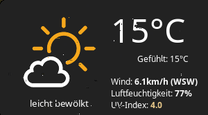
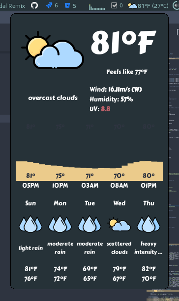
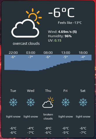
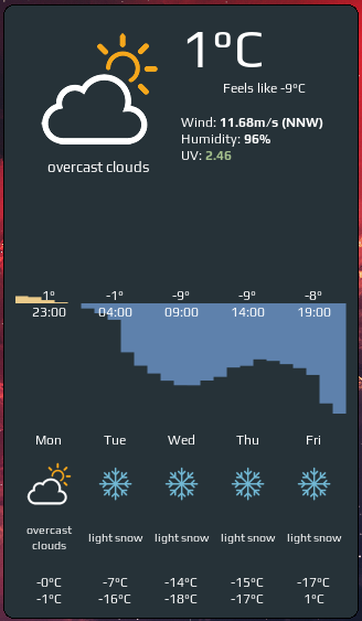
Weather Widget


This widget shows current, hourly, and daily weather forecast:

The widget consists of three sections:
- Current weather, including humidity, wind speed, and UV index
- Hourly forecast for the next 24 hours
- Daily forecast for the next five days
Customization
It is possible to customize widget by providing a table with all or some of the following config parameters:
| Name | Default | Description |
|---|---|---|
| coordinates | Required | Table with two elements: latitude and longitude, e.g. {46.204400, 6.143200} |
| api_key | Required | Get it here |
| font_name | beautiful.font:gsub("%s%d+$", "") |
Name of the font to use e.g. ‘Play’ |
| both_units_widget | false | Show temperature in both units - ‘28°C (83°F) |
| units | metric |
metric for celsius, imperial for fahrenheit |
| show_hourly_forecast | false | Show hourly forecast section |
| time_format_12h | false | 12 or 24 hour format (13:00 - default or 1pm) |
| show_daily_forecast | false | Show daily forecast section |
| icon_pack_name | weather-underground-icons |
Name of the icon pack, could be weather-underground-icon or VitalyGorbachev or create your own, more details below |
| icons_extension | .png |
File extension of icons in the pack |
| timeout | 120 | How often in seconds the widget refreshes |
Icons:
The widget comes with two predefined icon packs:
To add your custom icons, create a folder with the pack name under /icons and use the folder name in widget’s config. There should be 18 icons, preferably 128x128 minimum. Icons should also respect the naming convention, please check widget’s source.
Examples:
Custom font, icons
weather_curl_widget({
    api_key='<your-key>',
    coordinates = {45.5017, -73.5673},
    time_format_12h = true,
    units = 'imperial',
    both_units_widget = true,
    font_name = 'Carter One',
    icons = 'VitalyGorbachev',
    icons_extension = '.svg',
    show_hourly_forecast = true,
    show_daily_forecast = true,
}),
Only current weather
weather_curl_widget({
    api_key='<your-key>',
    coordinates = {45.5017, -73.5673},
}),
Installation
-
Download json parser for lua from github.com/rxi/json.lua and place it under ~/.config/awesome/ (don’t forget to star a repo ):
wget -P ~/.config/awesome/ https://raw.githubusercontent.com/rxi/json.lua/master/json.lua -
Clone this repo under ~/.config/awesome/:
git clone https://github.com/streetturtle/awesome-wm-widgets.git ~/.config/awesome/ -
Get Open Weather Map app id here: openweathermap.org/appid.
-
Require weather widget at the beginning of rc.lua:
local weather_widget = require("awesome-wm-widgets.weather-widget.weather") -
Add widget to the tasklist:
 s.mytasklist, -- Middle widget
     { -- Right widgets
         layout = wibox.layout.fixed.horizontal,
         ...
         --default
         weather_widget({
             api_key='<your-key>',
             coordinates = {45.5017, -73.5673},
         }),
         --customized
         weather_curl_widget({
             api_key='<your-key>',
             coordinates = {45.5017, -73.5673},
             time_format_12h = true,
             units = 'imperial',
             both_units_widget = true,
             font_name = 'Carter One',
             icons = 'VitalyGorbachev',
             icons_extension = '.svg',
             show_hourly_forecast = true,
             show_daily_forecast = true,
         }),
         ...
More screenshots
Only negative temperature:
Both positive and negative temperature:
How it works
TBW
Word Clock Widget
This widget displays the current time using words:

Customization
It is possible to customize widget by providing a table with all or some of the following config parameters:
| Name | Default | Description |
|---|---|---|
| main_color | beautiful.fg_normal |
Color of the word on odd position |
| accent_color | beautiful.fg_urgent |
Color of the word on even position |
| font | beautiful.font |
Font (Play 20) |
| is_human_readable | false | nine fifteen or fifteen past nine |
| military_time | false | 12 or 24 time format |
| with_spaces | false | Separate words with spaces |
Installation
Clone/download repo and use widget in rc.lua:
local word_clock = require("awesome-wm-widgets.word-clock-widget.word-clock")
...
s.mytasklist, -- Middle widget
	{ -- Right widgets
    	layout = wibox.layout.fixed.horizontal,
		...
		word_clock(),
	...
Screenshots
 word_clock{
    font = 'Carter One 12',
    accent_color = '#ff79c6',
    main_color = '#8be9fd',
    is_human_readable = true,
}

word_clock{
    font = 'Carter One 12',
    is_human_readable = true,
}

word_clock{
    font = 'Carter One 12',
    is_human_readable = true,
    military_time = true
}

word_clock{
    font = 'Carter One 12',
    accent_color = '#f00',
    main_color = '#0f0',
}

Wpctl volume widget
This is a volume widget for PipeWire, that uses wpctl for controlling volume and
selecting sinks and sources.
It is heavily based on the pactl and original volume widget, including its
customization and icon options. For screenshots, see the original widget.
Installation
Clone the repo under ~/.config/awesome/ and add widget in rc.lua:
local volume_widget = require('awesome-wm-widgets.wpctl-widget.volume')
...
s.mytasklist, -- Middle widget
	{ -- Right widgets
    	layout = wibox.layout.fixed.horizontal,
        ...
        -- default
        volume_widget(),
        -- customized
        volume_widget{
            widget_type = 'arc'
        },
Shortcuts
To improve responsiveness of the widget when volume level is changed by a shortcut use corresponding methods of the widget:
awful.key({}, "XF86AudioRaiseVolume", function () volume_widget:inc(5) end),
awful.key({}, "XF86AudioLowerVolume", function () volume_widget:dec(5) end),
awful.key({}, "XF86AudioMute", function () volume_widget:toggle() end),
Customization
It is possible to customize the widget by providing a table with all or some of the following config parameters:
Generic parameter
| Name | Default | Description |
|---|---|---|
mixer_cmd |
pwvucontrol |
command to run on middle click (e.g. a mixer program) |
step |
5 | How much the volume is raised or lowered at once (in %) |
widget_type |
icon_and_text |
Widget type, one of horizontal_bar, vertical_bar, icon, icon_and_text, arc |
device |
@DEFAULT_SINK@ |
Select the device id to control |
tooltip |
false | Display volume level in a tooltip when the mouse cursor hovers the widget |
For more details on parameters depending on the chosen widget type, please refer to the original Volume widget.
Spotify Shell
Features
- Supports following commands (same as
spclient):play/pause/next;- any other string will start a search and play the first result for a given search query;
- feh - shows the current artwork with
feh;
-
Stores history and allows navigate through it;
- Highly customizable
Controls
Keyboard navigation (copied from awful.prompt API documentation page):
| Name | Usage |
|---|---|
| CTRL+A | beginning-of-line |
| CTRL+B | backward-char |
| CTRL+C | cancel |
| CTRL+D | delete-char |
| CTRL+E | end-of-line |
| CTRL+J | accept-line |
| CTRL+M | accept-line |
| CTRL+F | move-cursor-right |
| CTRL+H | backward-delete-char |
| CTRL+K | kill-line |
| CTRL+U | unix-line-discard |
| CTRL+W | unix-word-rubout |
| CTRL+BACKSPAC | unix-word-rubout |
| SHIFT+INSERT | paste |
| HOME | beginning-of-line |
| END | end-of-line |
| CTRL+R | reverse history search, matches any history entry containing search term. |
| CTRL+S | forward history search, matches any history entry containing search term. |
| CTRL+UP | ZSH up line or search, matches any history entry starting with search term. |
| CTRL+DOWN | ZSH down line or search, matches any history entry starting with search term. |
| CTRL+DELETE | delete the currently visible history entry from history file. This does not delete new commands or history entries under user editing. |
Installation
-
Install sp - CLI client for Spotify for Linux:
 $ sudo git clone https://gist.github.com/fa6258f3ff7b17747ee3.git ~/dev/
 $ sudo ln -s ~/dev/sp /usr/local/bin/
Check if it works by running
sp help. -
Get an ‘id’ and ‘secret’ from developer.spotify.com and paste it in the header of the
sp(SP_IDandSP_SECRET) - this enables search feature. -
Clone this repo under ~/.config/awesome/
git clone https://github.com/streetturtle/awesome-wm-widgets.git ~/.config/awesome/ -
Require spotify-shell at the beginning of rc.lua:
local spotify_shell = require("awesome-wm-widgets.spotify-shell.spotify-shell") -
Add a shortcut which will show Spotify Shell widget:
awful.key({ modkey, }, "d", function () spotify_shell.launch() end, {description = "spotify shell", group = "music"}), -
It uses icon from Papirus Icon Theme. So you should either install this icon theme, or download an icon you want to use and provide path to it in spotify-shell.lua.
Translate Shell
This widget allows quickly translate words or phrases without opening a browser - just using Awesome. To provide direction of the translation add the 2 letters code of the source and target languages at the end of the phrase, for example hello enfr will translate hello from English to French. This widget is based on Yandex.Translate API.
Controls
- Mod4 + c - opens a translate prompt;
- left click on the popup widget - copies the translation to the clipboard and closes widget;
- right click on the popup widget - copies text to translate to the clipboard and closes widget.
Installation
-
Clone repo under ~/.config/awesome/
git clone https://github.com/streetturtle/awesome-wm-widgets.git ~/.config/awesome/ - Get an API key and paste it in translate.lua as value of the
API_KEYvariable -
Require widget in rc.lua:
local translate = require("awesome-wm-widgets.translate-widget.translate") -
Add a shortcut to run translate prompt:
 awful.key({ modkey }, "c",
           function()
               translate.show_translate_prompt()
           end,
           { description = "run translate prompt", group = "launcher" }
 ),
Awesome Buttons
Here I want to share a way of creating fancy looking interactive buttons:
Prerequisite
Add the section below to your rc.lua, which will be used as a canvas:
local buttons_example = wibox {
    visible = true,
    bg = '#2E3440',
    ontop = true,
    height = 1E00,
    width = 200,
    shape = function(cr, width, height)
        gears.shape.rounded_rect(cr, width, height, 3)
    end
}

local button = {} -- <- code examples go here

buttons_example:setup {
    button,
    valigh = 'center',
    layout = wibox.container.place
}

awful.placement.top(buttons_example, { margins = {top = 40}, parent = awful.screen.focused()})
Button
Buttons usually consist of text, icon or both. Let’s start with a simple text button:
local button = wibox.widget{
    text = "I'm a button!",
    widget = wibox.widget.textbox
}

For the image button replace the textbox by the imagebox. For the icon and text button, combine both of them in the fixed horizontal layout:
{
    {
        {
            image = icon,
            resize = true,
            forced_height = 20,
            widget = wibox.widget.imagebox
        },
        margins = 4,
        widget = wibox.container.margin
    },
    {
        {
            text = 'Click me!',
            widget = wibox.widget.textbox
        },
        top = 4, bottom = 4, right = 8,
        widget = wibox.container.margin
    },
    layout = wibox.layout.align.horizontal
}
Next step is to add some margins and a background. For background we’ll use wibox.container.background, it allows to set the background itself (bg = '#4C566A'). By using alpha channel it’s possible to make a transparent background (bg = '#00000000') which will be useful in the next step when adding hover effect. Apart from a background, it also sets shape and borders, which allows to create ‘outline’ buttons (shape_border_width = 1, shape_border_color = '#4C566A'). These three types are shown in the example below:
local button = wibox.widget{
    {
        {
            text = "I'm a button!",
            widget = wibox.widget.textbox
        },
        top = 4, bottom = 4, left = 8, right = 8,
        widget = wibox.container.margin
    },
    bg = '#4C566A', -- basic
    bg = '#00000000', --tranparent
    shape_border_width = 1, shape_border_color = '#4C566A', -- outline
    shape = function(cr, width, height)
        gears.shape.rounded_rect(cr, width, height, 4)
    end,
    widget = wibox.container.background
}

Hover effects
Now the button looks like a button, but doesn’t behave like one. First thing is to change colors when mouse cursor hovers over the button. To do it we can leverage the signals: mouse::enter and mouse::leave. When using signals, we have access the to widget, so it’s pretty simple to change the color. Below I use alpha channel to darken the color of the button a bit, for all three types of button discussed above it works well:
button_basic:connect_signal("mouse::enter", function(c) c:set_bg("#00000066") end)
button_basic:connect_signal("mouse::leave", function(c) c:set_bg('#4C566A') end)
button_tranparent:connect_signal("mouse::enter", function(c) c:set_bg("#00000066") end)
button_tranparent:connect_signal("mouse::leave", function(c) c:set_bg('#00000000') end)
button_outline:connect_signal("mouse::enter", function(c) c:set_bg("#00000066") end)
button_outline:connect_signal("mouse::leave", function(c) c:set_bg('#00000000') end)
Note that you need to set the initial color of the button for the mouse::leave signal.
Second thing is to change the cursor:
local old_cursor, old_wibox
button_basic:connect_signal("mouse::enter", function(c)
    c:set_bg("#00000066")
    local wb = mouse.current_wibox
    old_cursor, old_wibox = wb.cursor, wb
    wb.cursor = "hand1"
end)
button_basic:connect_signal("mouse::leave", function(c)
    c:set_bg('#4C566A')
    if old_wibox then
        old_wibox.cursor = old_cursor
        old_wibox = nil
    end
end)
Button click effects
Another effect is changing the color of the button when the button is pressed/released:
button_basic:connect_signal("button::press", function(c) c:set_bg("#000000") end)
button_basic:connect_signal("button::release", function(c) c:set_bg('#00000066') end)
Onclick action
To perform some action when the button is clicked you need to handle press/release signal. The important part here is to properly handle the button which was used, otherwise any click will trigger the function execution:
button_basic:connect_signal("button::press", function(c, _, _, button)
    if button == 1 then  naughty.notify{text = 'Left click'}
    elseif button == 2 then naughty.notify{text = 'Wheel click'}
    elseif button == 3 then naughty.notify{text = 'Right click'}
    end
end)
Summary
As you can see it is pretty easy to create interactive nice-looking buttons. But if you use multiple buttons in your widget, you may have quite a lot of boilerplate code. To solve this issue I created an awesome-buttons library, which simplifies this process:
awesomebuttons.with_text{ type = 'flat', text = 'Ola', color = '#f8f', text_size = 12 },
awesomebuttons.with_icon{ type = 'outline', icon = 'zoom-in', color = '#f8f', shape = 'rounded_rect' },
awesomebuttons.with_icon_and_text{ icon = 'check-circle', text = 'With Icon!', color = '#f48' },
Please refer to the repo’s README for more details. It is still in progress.
Awesome Taglist
Here is nice-looking and super easy way to customize taglist. The idea is simple - literally write ‘awesome’ or ‘awesomewm’ (if you want to keep 9 tags) in the taglist using characters from the Awesome logo.
To do it you need to install a font which was generated from the svg images of the letters from the logo. Download it from here and place it under ~/.local/share/fonts. Then name your tags in rc.lua using it. The font has two types of letters: uppercase are for the bold characters:
awful.tag({ "A", "W", "E", "S", "O", "M", "E", "W", "M"},
and lowercase for the outline characters:
awful.tag({ "a", "w", "e", "s", "o", "m", "e", "w", "m"},
To have same colors as on the screenshots, use following configuration:
theme.lua
theme.taglist_fg_focus    = "#3992af"
theme.taglist_fg_occupied = "#164b5d"
theme.taglist_fg_urgent   = "#ED7572"
theme.taglist_fg_empty    = "#828282"
theme.taglist_spacing     = 2
theme.taglist_font        = "awesomewm 11"
Fade effect on a widget
Here is a nice fade-out / fade-in effect which can be applied on text/image widgets (or any other widget which supports opacity). It can be used either on click or on hover actions:
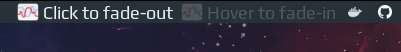
Fade effect on a widget
local fade_widget = wibox.widget {
    {
        id = 'icon',
        image = '/usr/share/icons/Yaru/24x24/apps/org.gnome.PowerStats.png',
        widget = wibox.widget.imagebox
    },
    {
        id = 'text',
        text = 'Click to fade',
        widget = wibox.widget.textbox
    },
    spacing = 4,
    layout = wibox.layout.fixed.horizontal,
    toggle_fade = function(self, is_fade)
        self:get_children_by_id('icon')[1]:set_opacity(is_fade and 0.2 or 1)
        self:get_children_by_id('icon')[1]:emit_signal('widget::redraw_needed')
        self:get_children_by_id('text')[1]:set_opacity(is_fade and 0.2 or 1)
        self:get_children_by_id('text')[1]:emit_signal('widget::redraw_needed')
    end
}

-- on click
local faded = true
fade_widget:connect_signal('button::press', function(c)
    faded = not faded
    c:toggle_fade(not faded)
end)

-- on hover
fade_widget:toggle_fade(true)
fade_widget:connect_signal('mouse::enter', function(c) c:toggle_fade(false) end)
fade_widget:connect_signal('mouse::leave', function(c) c:toggle_fade(true) end)
How it works
Let’s start by creating a simple widget which has an icon and some text:
local fade_widget = wibox.widget {
    {
        image = '/usr/share/icons/Yaru/24x24/apps/org.gnome.PowerStats.png',
        widget = wibox.widget.imagebox
    },
    {
        text = 'Click to fade',
        widget = wibox.widget.textbox
    },
    spacing = 4,
    layout = wibox.layout.fixed.horizontal
}
Fade effect can be achieved by lowering the opacity of the widget. Luckily both textbox and imagebox have opacity property, which is set to 1 by default. The cleanest way to change widget’s property (or properties of nested widgets) is to add a function which will hide all the ugliness of accessing the nested widgets inside and expose a clean API outside:
1
2
3
4
5
6
7
8
9
10
11
12
13
14
15
16
17
18
19
20
local fade_widget = wibox.widget {
    {
        id = 'icon',
        image = '/usr/share/icons/Yaru/24x24/apps/org.gnome.PowerStats.png',
        widget = wibox.widget.imagebox
    },
    {
        id = 'text',
        text = 'Click to fade',
        widget = wibox.widget.textbox
    },
    spacing = 4,
    layout = wibox.layout.fixed.horizontal,
    toggle_fade = function(self, is_fade)
        self:get_children_by_id('icon')[1]:set_opacity(is_fade and 0.2 or 1)
        self:get_children_by_id('icon')[1]:emit_signal('widget::redraw_needed')
        self:get_children_by_id('text')[1]:set_opacity(is_fade and 0.2 or 1)
        self:get_children_by_id('text')[1]:emit_signal('widget::redraw_needed')
    end
}
Few things to note here:
- Added widget identifiers (line 3, 8) so that we can access them later - line 15-18. We are using JavaScript-like syntax, described in section Accessing widgets of the documentation
- When changing text in textbox the widget is redrawn automatically (same for the image in imagebox), however when changing opacity the redraw is not triggered, this is why we call it explicitly - line 16, 18.
Now we can easily trigger the fade effect on the widget by calling a toggle_fade(true) method. The only thing left is to add a mouse handler:
- to toggle on mouse click
local faded = true
fade_widget:connect_signal('button::press', function(c)
    faded = not faded
    c:toggle_fade(not faded)
end)
- to toggle on hover:
fade_widget:toggle_fade(true)
fade_widget:connect_signal('mouse::enter', function(c)
    c:toggle_fade(false)
end)
fade_widget:connect_signal('mouse::leave', function(c)
    c:toggle_fade(true)
end)
Lists
This type of UI element is also called menu (for example in GTK). As an example let’s create a bookmarks widget - a widget will show a static list of sites. If item in the list is clicked - the site will be opened in the browser. You can find the created widget here
Prerequisite
Create a bookmark-widget.lua file under ~/.config/awesome/tutorials folder. Then include it in your rc.lua and add widget to the wibox:
local bookmark_widget = require("tutorials.bookmark-widget.bookmark-widget")
...
s.mytasklist, -- Middle widget
{ -- Right widgets
    ...
    bookmark_widget
To have a list popup, first we need to have an “anchor” widget, clicking on which should toggle the visibility of the list, so let’s create it, it will be an icon:
local awful = require("awful")
local wibox = require("wibox")
local gears = require("gears")
local beautiful = require("beautiful")

local HOME = os.getenv('HOME')
local ICON_DIR = HOME .. '/home-dev/awesome-wm-widget-tutorial/awesome-wm-widgets/bookmark-widget/icons/'

local bookmark_widget = wibox.widget {
    {
        image = ICON_DIR .. 'bookmark.svg',
        resize = true,
        widget = wibox.widget.imagebox,
    },
    margins = 4,
    widget = wibox.container.margin
}

-- code mentioned below goes here

return bookmark_widget
Now restart awesome and boom! - you have a widget:
Widget structure
We are going to use an awful.popup as it’s quite easy to show/hide it and also to place it on the screen. On the popup we’ll add text and image widgets, arranged in a vertical list using layout.fixed layout plus container.margin and container.background to make it look nice and to change the background color on mouse hover:
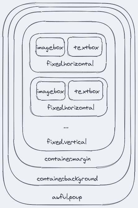
Let’s start
Each item in the list will have three components: an icon, a text and an url to open when the item is clicked. Let’s represent it in lua:
local menu_items = {
    { name = 'Reddit', icon_name = 'reddit.svg', url = 'https://www.reddit.com/' },
    { name = 'StackOverflow', icon_name = 'stackoverflow.svg', url = 'http://github.com/' },
    { name = 'GitHub', icon_name = 'github.svg', url = 'https://stackoverflow.com/' },
}
Then let’s define a popup and rows (which will hold the vertical layout), to which we will add items later on:
local popup = awful.popup {
    ontop = true,
    visible = false, -- should be hidden when created
    shape = function(cr, width, height)
        gears.shape.rounded_rect(cr, width, height, 4)
    end,
    border_width = 1,
    border_color = beautiful.bg_focus,
    maximum_width = 400,
    offset = { y = 5 },
    widget = {}
}
local rows = { layout = wibox.layout.fixed.vertical }
Now we’ll just traverse over the menu_items, create a row (let’s start with a simple textbox widget), add it to rows and then add rows to the popup:
for _, item in ipairs(menu_items) do

    local row = wibox.widget {
        text = item.name,
        widget = wibox.widget.textbox
    }
    table.insert(rows, row)
end
popup:setup(rows)
The last thing left is to toggle popup visibility on mouse click on the bookmark_widget:
bookmark_widget:buttons(
    awful.util.table.join(
        awful.button({}, 1, function()
            if popup.visible then
                popup.visible = not popup.visible
            else
                 popup:move_next_to(mouse.current_widget_geometry)
            end
    end))
)
Restart awesome and click on the widget:
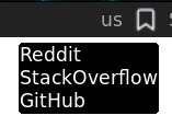
Make it pretty
To add an icon let’s wrap textbox in a fixed.horizontal layout and add an imagebox with an icon in front of it. Note that it’s important to set the maximum height and width of the image, otherwise it will take up all available space:
local row = wibox.widget {
    {
        image = ICON_DIR .. item.icon_name,
        forced_width = 16,
        forced_height = 16,
        widget = wibox.widget.imagebox
    },
    {
        text = item.name,
        widget = wibox.widget.textbox
    },
    layout = wibox.layout.fixed.horizontal
}
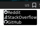
Looks ok, but icon and text are too close to each other. One way to fix it is to use a spacing property of the fixed layout, which sets the distance between widgets:
local row = wibox.widget {
    {
        image = ICON_DIR .. item.icon_name,
        forced_width = 16,
        forced_height = 16,
        widget = wibox.widget.imagebox
    },
    {
        text = item.name,
        widget = wibox.widget.textbox
    },
    spacing = 12, -- <--
    layout = wibox.layout.fixed.horizontal
}
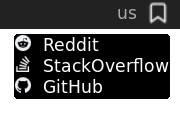
Now let’s add margins around each item:
local row = wibox.widget {
    {
        {
            image = ICON_DIR .. item.icon_name,
            forced_width = 16,
            forced_height = 16,
            widget = wibox.widget.imagebox
        },
        {
            text = item.name,
            widget = wibox.widget.textbox
        },
        spacing = 12,
        layout = wibox.layout.fixed.horizontal
    },
    margins = 8,
    widget = wibox.container.margin
}
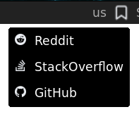
One more step is to wrap margins in a background. Visually it won’t change anything (unless you want to change the default color, which is bg_normal from your theme), but it will be useful later, when we will add mouse hover effect to the menu item
local row = wibox.widget {
    {
        {
            {
                image = ICON_DIR .. item.icon_name,
                forced_width = 16,
                forced_height = 16,
                widget = wibox.widget.imagebox
            },
            {
                text = item.name,
                widget = wibox.widget.textbox
            },
            spacing = 12,
            layout = wibox.layout.fixed.horizontal
        },
        margins = 8,
        widget = wibox.container.margin
    },
    bg = beautiful.bg_normal,
    widget = wibox.container.background
}
Looks good now! Let’s add some interactivity, like changing background on mouse hover, note that c in the callback function’s parameter is a row, defined above, which is a background widget, so we can set the background color with set_bg method:
row:connect_signal("mouse::enter", function(c)
    c:set_bg(beautiful.bg_focus)
end)
row:connect_signal("mouse::leave", function(c)
    c:set_bg(beautiful.bg_normal)
end)
Let’s also change a cursor:
local old_cursor, old_wibox
row:connect_signal("mouse::enter", function()
    local wb = mouse.current_wibox
    old_cursor, old_wibox = wb.cursor, wb
    wb.cursor = "hand1"
end)
row:connect_signal("mouse::leave", function()
    if old_wibox then
        old_wibox.cursor = old_cursor
        old_wibox = nil
    end
end)

Make it work
The last bit is to open the link, when mouse is clicked. We’ll use the buttons method which accepts a table of buttons. First parameter is a table with modifiers (we use none), second is a button number (1 is a left mouse button), third parameter is a callback function which is called on press action. When mouse button is clicked we want to hide the popup and open the link in the default browser. xdg-open is used exactly for that:
row:buttons(
    awful.util.table.join(
        awful.button({}, 1, function()
            popup.visible = not popup.visible
            awful.spawn.with_shell('xdg-open ' .. item.url)
        end)
    )
)
Future improvements
The menu or list widget, created above, looks pretty standard, as it has icon and text. However, playing with different layouts you can add more items to it, for example you may follow material design guidance and create lists with many components, like three-lines lists with visuals and controls. As an example here is a list from gitlab widget:

And another one from github-activity-widget:
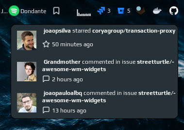
And one more from docker widget:
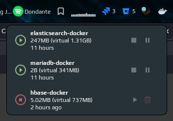
Widget described above can be found here
Toggable Systray
Here is a trick to toggle system tray visibility in Awesome using keyboard shortcut. The reason to do that is pretty simple - it looks ugly in some themes. In my case I don’t like two things about it:
-
I didn’t manage to make it transparent which is quite important since I am using transparent tasklist and widgets. I tried
wibox.widget.systray.opacityproperty which doesn’t work as well as setting an alpha channel forbeautiful.bg_systray. -
Colors of the apps are very different from theme colors which makes systray look flashy and disturbing:

On the other hand not showing it at all will make interaction with some apps pretty difficult. So having a keyboard shortcut which toggles its visibility sounds like a good solution for the problems mentioned above.
To do it create a systray widget inside awful.screen.connect_for_each_screen function:
awful.screen.connect_for_each_screen(function(s)
    ...
    s.systray = wibox.widget.systray()
    s.systray.visible = false
    ...
Then add it to the the wibox: replace default wibox.widget.systray() by s.systray inside s.mywibox:setup method:
s.mywibox:setup {
    ...
    s.mytasklist, -- Middle widget
    {
        ...
        s.systray
    ...
Almost done, the only thing left is a shortcut, I use mod + =:
awful.key({ modkey }, "=", function ()
    awful.screen.focused().systray.visible = not awful.screen.focused().systray.visible
    end, {description = "Toggle systray visibility", group = "custom"})
)
Ellipsize
Ellipsizes string to a given length
local function ellipsize(text, length)
    return (text:len() > length and length > 0)
        and text:sub(0, length - 3) .. '...'
        or text
end
To time ago
Converts seconds to “time ago” represenation, like ‘1 hour ago’
local function to_time_ago(seconds)
    local days = seconds / 86400
    if days > 1 then
        days = math.floor(days + 0.5)
        return days .. (days == 1 and ' day' or ' days') .. ' ago'
    end

    local hours = (seconds % 86400) / 3600
    if hours > 1 then
        hours = math.floor(hours + 0.5)
        return hours .. (hours == 1 and ' hour' or ' hours') .. ' ago'
    end

    local minutes = ((seconds % 86400) % 3600) / 60
    if minutes > 1 then
        minutes = math.floor(minutes + 0.5)
        return minutes .. (minutes == 1 and ' minute' or ' minutes') .. ' ago'
    end
end